Brand Guidelines — V1.0
Borrowed momentum.
Slingshot is an insurance carrier built inside the vertical SaaS ecosystem, using the environment around it to accelerate farther and faster than it could alone. This is the identity system that carries that idea.
The Slingshot Idea
Spacecraft do not carry enough fuel to reach the outer planets. They borrow the momentum of the planets themselves: fly close, let gravity bend the trajectory, and leave carrying speed the engines never produced. The maneuver is called a gravitational slingshot. It is not a metaphor chosen for decoration. It is the operating model of the company.
“We named it Slingshot after the gravitational slingshot — a technique where spacecraft use external forces to accelerate farther, faster, with less fuel. That’s exactly what we’re doing with insurance: using technology to create leverage to help our partners move faster and go further than traditional carriers ever could.”
— Ethan, Founder
“He kept thinking about the idea of using the environment around us to accelerate farther and faster than we could on our own. For Slingshot, that environment is the vertical SaaS ecosystem we are embedded insurance within. It allows us to build and scale the carrier from zero to meaningful size much faster than a traditional go-to-market motion would allow.”
— from the founding brief
Everything in this guide serves that single idea. The mark traces the maneuver. The palette holds the discipline. The typography carries the engineering. Use the system as specified and every touchpoint compounds the same story: external force, converted into velocity.
The Mark
The Slingshot mark is a trajectory diagram. Three parallel bands enter from the upper right, wrap a full turn around an unmarked center, and exit on the same diagonal — tighter, faster, together. The circular void at the center is the mass being orbited: the ecosystem the company builds inside. The bands are the path. The mark does not illustrate a slingshot; it plots one.
Where it comes from
The letterforms that inspired the mark come from Articulate, a display face whose bowl geometry suggested the orbit. In the primary lockup, the mark takes the place of the lowercase g in the wordmark — the one letter whose anatomy already contains a loop and a descender, resolved here as an orbit and an exit trajectory.
The display face stayed an inspiration, not a system font. The identity stands on its own typography; the mark carries the memory of the letter without borrowing its typeface. This is deliberate. A brand that dresses every layer in the logo’s costume reads as a gimmick. A brand that lets one engineered gesture do the work reads as conviction.
Anatomy
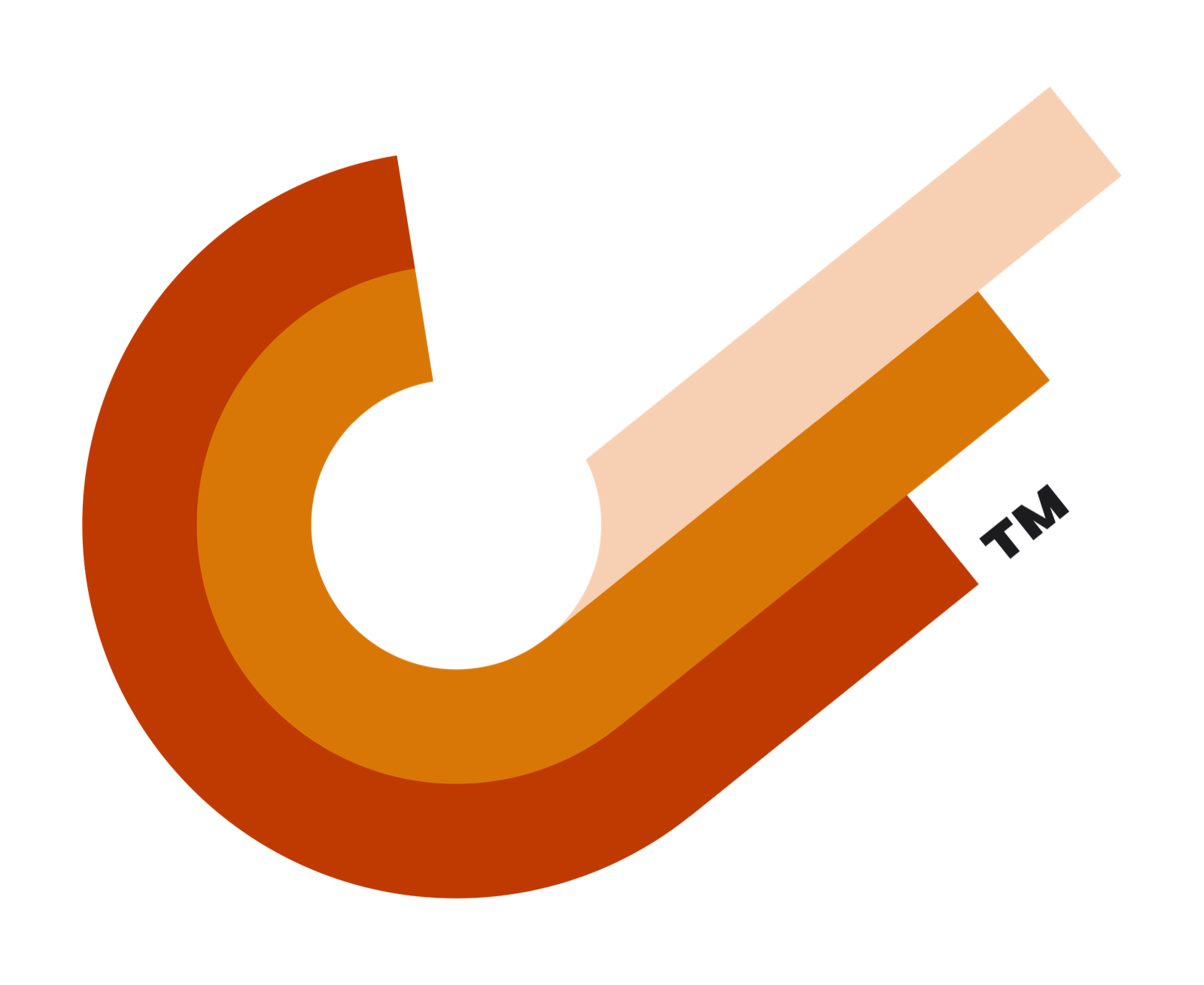
- The orbit. Two curved bands, deep rust outside, amber inside, complete the turn around the center. They are the gravity assist: the path bending around borrowed mass.
- The exit. A third band in pale peach leaves the curve at speed, straight and unbending. It is drawn longer than the entry — the craft leaves faster than it arrived.
- The center. Empty by design. The mass that provides the acceleration is the partner ecosystem, not Slingshot itself. The mark never fills it.
The mark’s three artwork colors (deep rust, amber, pale peach) are fixed relationships embedded in the master files. They are logo artwork, not palette tokens. Never rebuild, re-pick, or approximate them; place the supplied files.
One mark, three duties
The identity ships in three configurations. Choose by duty, not by taste.
Variant 1 — Main ID
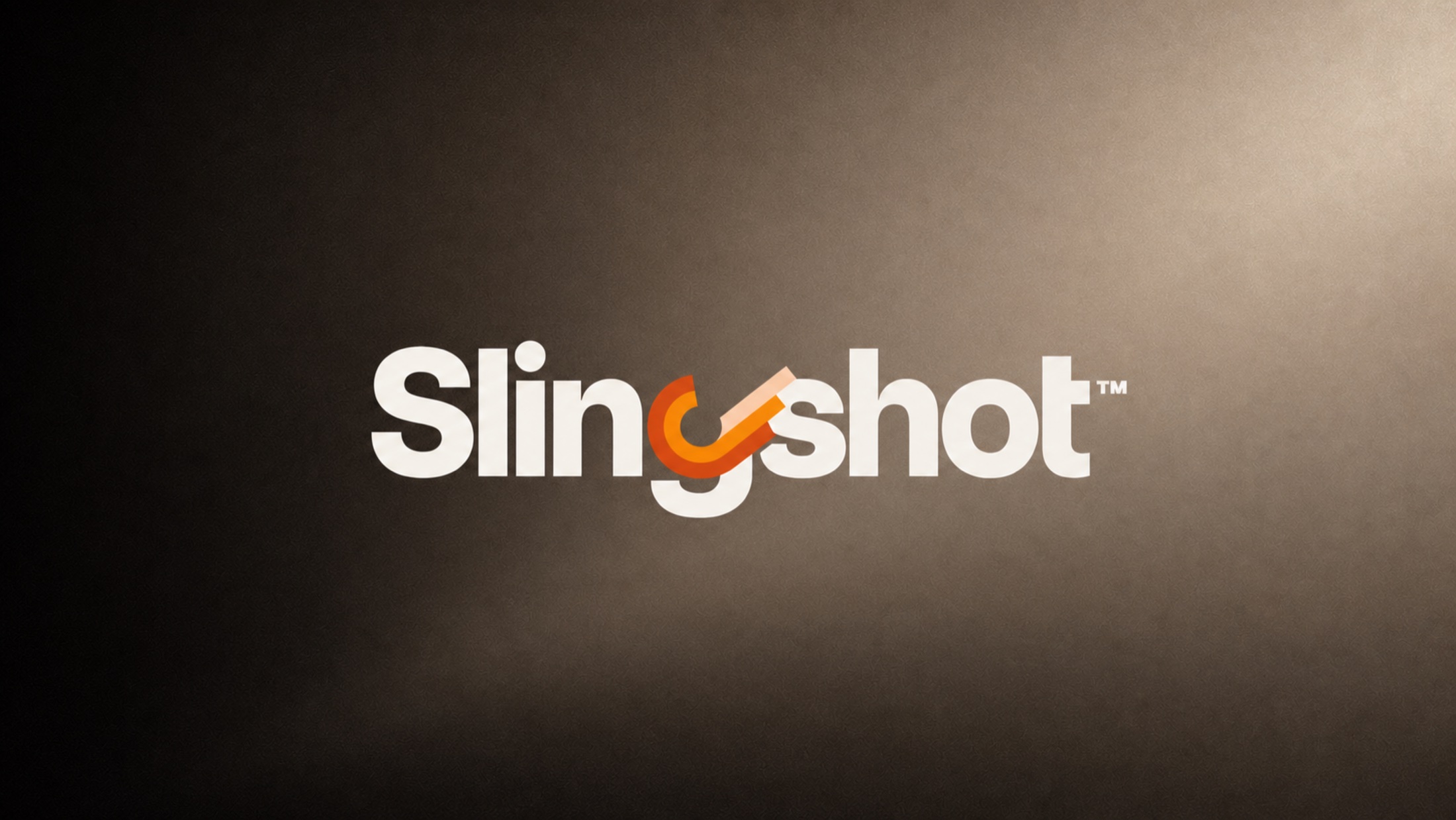
The primary lockup. The wordmark Slingshot set in heavy geometric lowercase with the mark integrated as the g. This is the brand at full strength: one word, one maneuver, inseparable. Use it wherever the brand introduces itself — site headers, title cards, presentation covers, campaign end frames.


Variant 2 — Secondary ID
The horizontal lockup. The mark sits alone at the left, at full detail, beside the wordmark set with a conventional g. Use it where the integrated g would render too small to read — navigation bars, document headers, email signatures, partner co-branding rows, and any strip wider than it is tall. The secondary ID gives the mark more relative size, so it holds detail at small scale better than the main ID.
Variant 3 — The mark alone
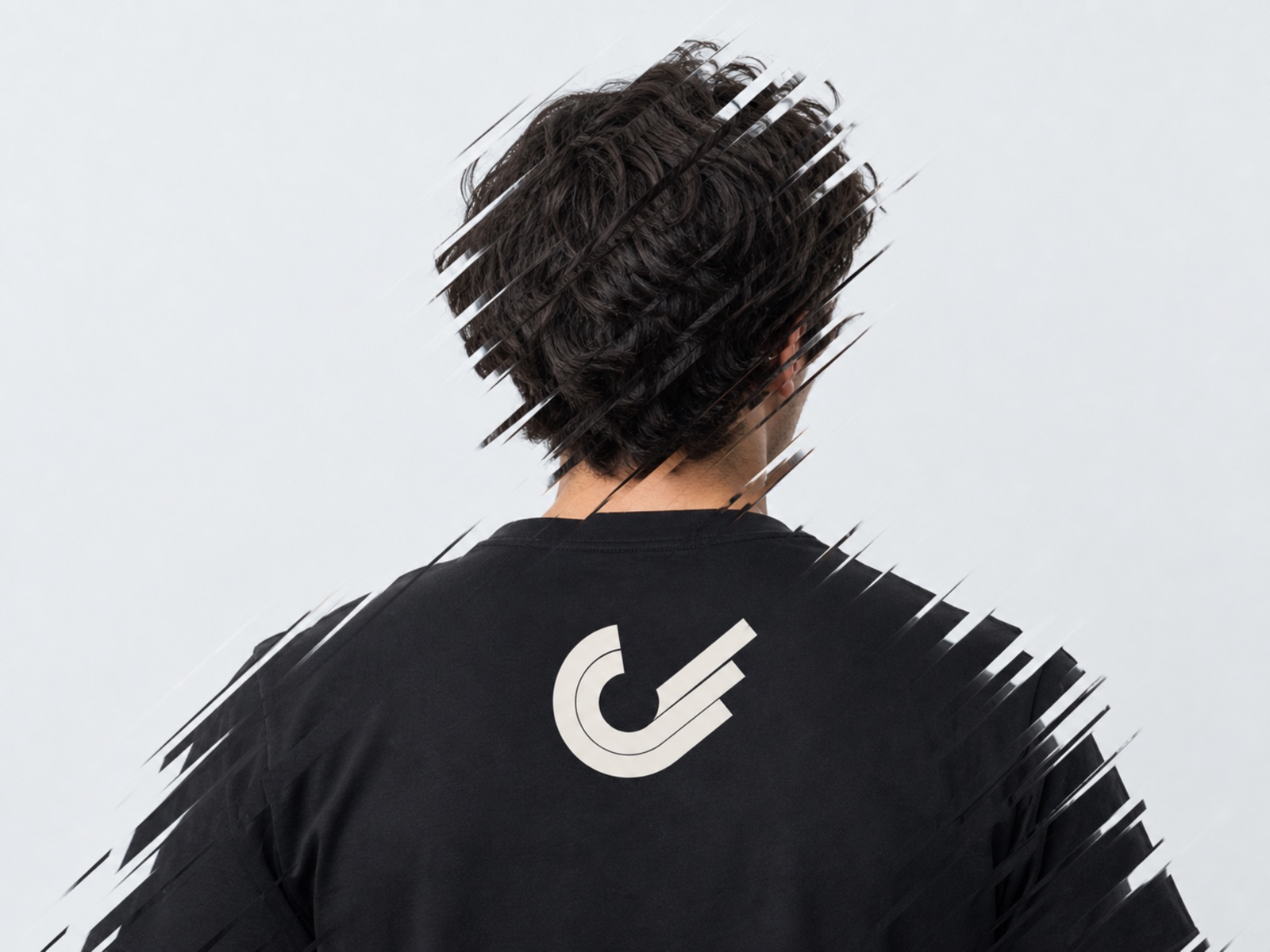
The trajectory by itself. Reserved for contexts where the name is already established or the space cannot carry a word: avatars, app icons, apparel, watermarks, favicons, the corner of a document that says Slingshot somewhere else. The mark alone is a privilege of recognition; do not lead with it in first-contact materials.
Negative artwork on Carbon — the lockup on its native dark ground
When full color is not available
Every configuration exists in reduced-color artwork for constrained reproduction. The logic is uniform across the set: files named light are light artwork for dark surfaces; files named dark are dark artwork for light surfaces.
1color-main-id-light.png / 1color-main-id-dark.png — the main ID rendered entirely in one color (Warm Stone or Carbon). The mark’s bands keep their separation as fine keylines. Use for single-ink print, embossing, engraving, and any surface where the full-color mark would clash or fail contrast.
1color-secondary-id-light.png / 1color-secondary-id-dark.png — the secondary ID under the same rules.
logo-mark-light.png / logo-mark-dark.png — the mark alone as a solid one-color silhouette, band separation preserved as keylines. The workhorse for etching, foil, vinyl cut, and UI contexts that demand a monochrome asset.
logo-mark-knockout.png / logo-mark-knockout-dark.png — the mark drawn in outline only: a single-weight keyline with no fills. The surface itself becomes the mark’s body. Use on texture, photography, fabric, and materials where a solid fill would sit heavy — the knockout lets the material show through. knockout is the light keyline for dark surfaces; knockout-dark is the dark keyline for light surfaces.




Selection rule
- Can the surface carry full color? Use positive or negative full-color artwork.
- One ink only? Use the 1-color lockups or the solid one-color mark.
- Should the material itself show through? Use the knockout keyline.
- Never construct a new variant. If the situation is not covered here, ask the brand team.
Logo Usage
A trajectory only works if nothing interferes with it. The rules below are not ornamentation preferences; they are the minimum conditions under which the mark stays legible, ownable, and consistent across every surface it lands on.
Clear space
Define the unit x as the stroke width of the mark’s outer band. Keep clear space of at least 2x on all sides of the mark alone, and at least the height of the wordmark’s lowercase letters on all sides of the main and secondary lockups. Nothing enters this zone: no type, no rules, no icons, no page edges, no other marks. When in doubt, give it more room. The mark earns attention by having space to move through, not by touching things.
Minimum size
The mark’s three bands are its identity. Below a certain size they merge, and the mark stops being a trajectory and becomes a smudge. Observe these floors:
- Main ID: no smaller than 140 px wide on screen, 35 mm in print.
- Secondary ID: no smaller than 120 px wide on screen, 30 mm in print.
- Mark alone, full color: no smaller than 32 px tall on screen, 10 mm in print.
- Favicon and app-icon sizes (below 32 px): use the solid one-color mark (
logo-mark-light.png/logo-mark-dark.png), whose keylines survive small rendering better than three color fields.
Min 140px screen / 35mm print
Min 120px screen / 30mm print
Min 32px screen / 10mm print
Backgrounds
- Light surfaces (White, Warm Stone, light imagery): positive artwork. Carbon letterforms, full-color mark.
- Dark surfaces (Carbon, the dark-mode ladder, dark imagery): negative artwork. Warm Stone letterforms, full-color mark.
- Photography: place the lockups only where the image holds a quiet, consistent field — deep shadow or clean sky, never texture with competing detail. If the image cannot offer that field, use the knockout keyline mark and let the photograph become the fill, as in the apparel application.
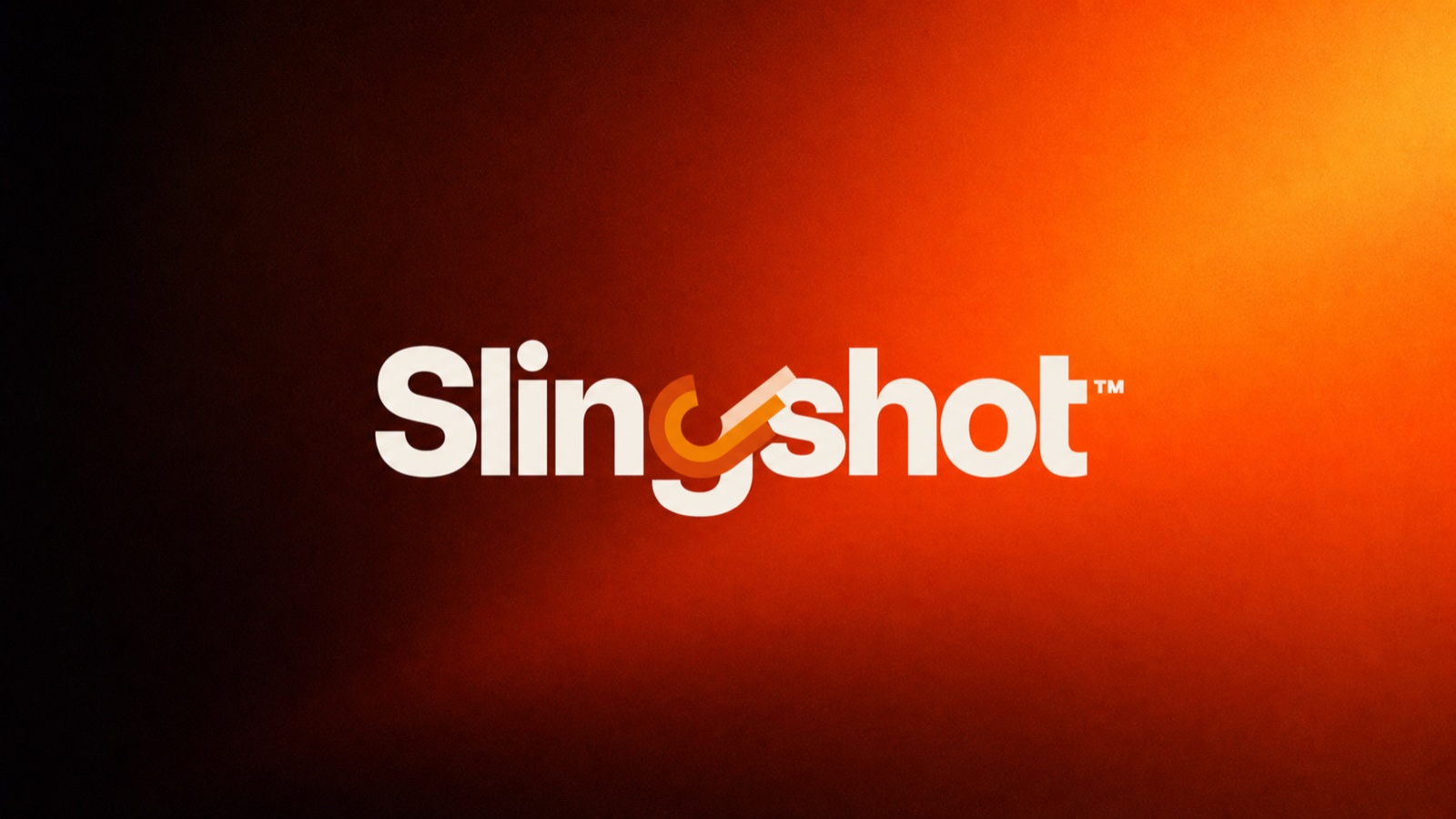
- Color fields: never place the full-color mark on ambers, oranges, or rusts that neighbor its own artwork colors. On those fields, use the one-color artwork in Carbon or Warm Stone, whichever passes contrast.
Fig. 05 — Backgrounds
Never
- Never rotate the mark. The exit trajectory is drawn at its angle for a reason; changing it changes the physics.
- Never recolor the bands, and never rebuild them from palette tokens.
- Never separate the exit band from the orbit, or use a single band alone.
- Never fill the center of the mark.
- Never stretch, compress, shear, or add perspective.
- Never add drop shadows, glows, bevels, or gradients to the artwork.
- Never set the wordmark in another typeface and reattach the mark as a g.
- Never place positive artwork on dark surfaces, or negative artwork on light ones.
- Never outline the solid versions or thicken the knockout keyline.
- Never crowd the clear space — no type, rules, or icons inside the zone.
Color
The palette is small on purpose. Two neutrals do the structural work, one accent carries the signal, and everything else is surface hierarchy. The discipline mirrors the visual language: black, white, and a punch of color. The system is digital-first; values are specified as hex and validated against WCAG contrast. No print equivalents are defined at this time — for print work, supply the hex values to the printer and proof against screen.
| Token | Hex | Role |
|---|---|---|
| Carbon | #1C1C1E | Primary text, headers, anchoring surfaces |
| Warm Stone | #F5F0EB | Page backgrounds, neutral surfaces |
| Signal Amber | #D97706 | CTAs, links, highlights |
| Deep Gray | #3A3A3C | Secondary text, borders |
| White | #FFFFFF | Cards, elevated surfaces |
Near-black, never pure black. The color of the system’s structure: headlines, body text, and the surfaces that anchor a layout. Warmth lives in the stone, not the ink.
The default page. A warm neutral that keeps the system human where a cold gray would read as laboratory. Most of the brand, most of the time, is Carbon on Warm Stone.
The single punch of color. Amber marks the thing that matters: the action, the link, the highlighted node. Its power is rationed — if amber appears more than once per view, it usually appears once too often.
The quiet middle: secondary text, borders, dividers. Deep Gray does hierarchy so Carbon does not have to shout.
Elevation. Cards and raised surfaces sit in White against Warm Stone, and the difference between the two is the shadow system.
Dark mode
Dark mode is not an inversion; it is a re-anchoring. The background is #121214 — near-black, never pure black. Surfaces climb a fixed ladder: #1C1C1E → #2C2C2E → #3A3A3C, each step one level of elevation. Signal Amber elevates to #F59E0B in dark contexts to hold its energy against the deeper field.
Contrast
All primary pairings meet WCAG AA:
- 14.8:1 AA Carbon on Warm Stone — 14.8:1
- 10.4:1 AA Deep Gray on White — 10.4:1
- 4.6:1 AA Signal Amber on White — 4.6:1
Amber on White passes AA for large text and UI components; do not set body copy in amber. Amber is a signal, not a voice.
Logo artwork colors
The mark’s deep rust, amber, and pale peach are artwork, embedded in the production files, tuned for the mark alone. They are not palette tokens and never appear in UI, charts, or layout. The one shared instinct is the accent: where the mark uses amber to carry motion, the interface uses Signal Amber to carry action. The relationship is conceptual, not chromatic — do not sample colors out of the logo.
Typography
Three typefaces, three jobs, no overlap. Display type states the idea. Body type explains it. Mono type proves it with the numbers. All three ship on Google Fonts, which keeps the system reproducible anywhere without licensing friction. And none of them is the face that inspired the mark — the display letterform that shaped the g stays inside the logo, so the identity stands on its own typography.
Borrowed momentum, engineered into an identity.
Headlines and display settings only. Geometric precision, squared terminals: the voice of the engineering. If it is larger than a paragraph, it is Space Grotesk.
Body text holds a 65 to 75 character measure, sits at a 1.5 line height, and never drops below 16 pixels on mobile. Set this way, a page of specification reads as calmly as a page of prose, and the system explains itself without raising its voice.
Everything read at length: paragraphs, labels, navigation, forms. Inter disappears into the reading, which is its job.
Figures, tables, tokens, code. Ligatures disabled — every character stays itself, because in data, substitution is corruption.
Scale
Fig. 07 — Type scale
Rules
- Never interchange typeface roles. Space Grotesk does not set paragraphs; Inter does not set display.
- Body text is at least 16 px on mobile.
- No more than three weights per page.
- Never center body text.
- No italics anywhere in the system.
- Hold a 65–75 character measure on reading text.
- Apply
text-wrap: balanceto headings.
The Architecture Beneath
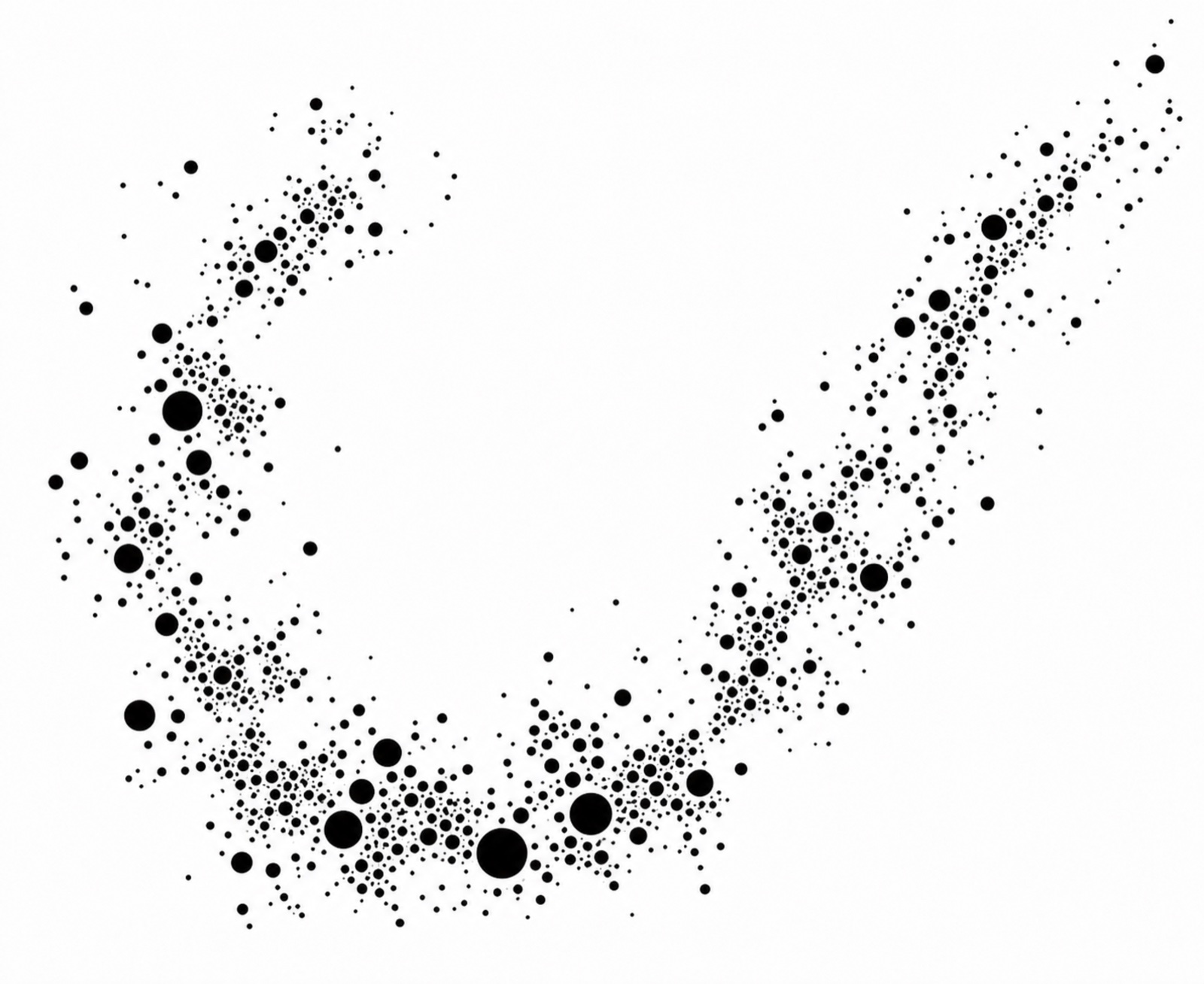
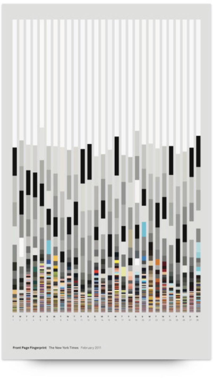
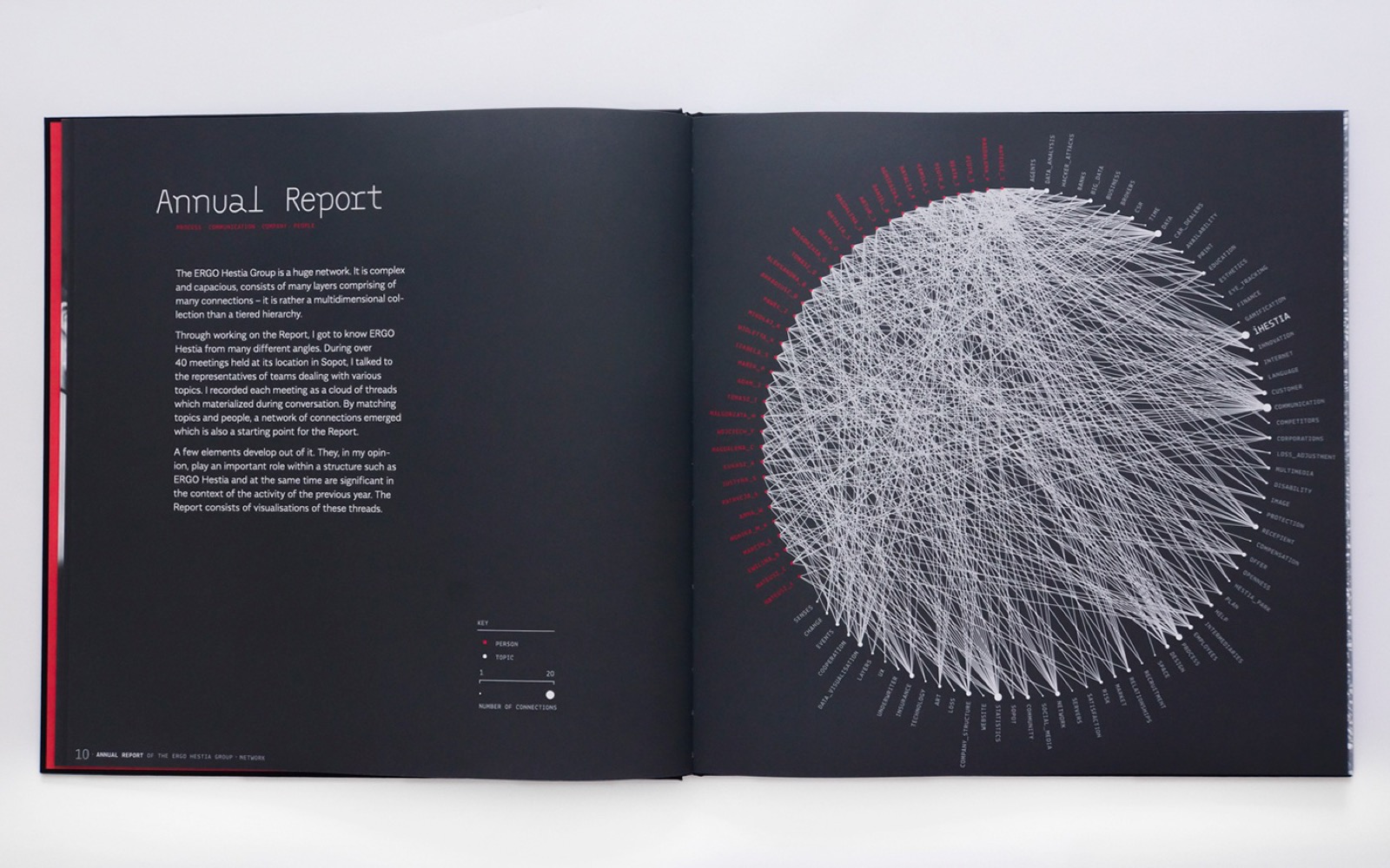
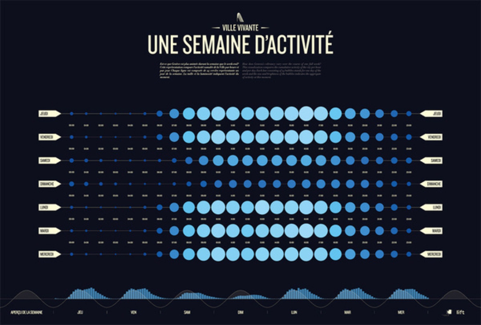
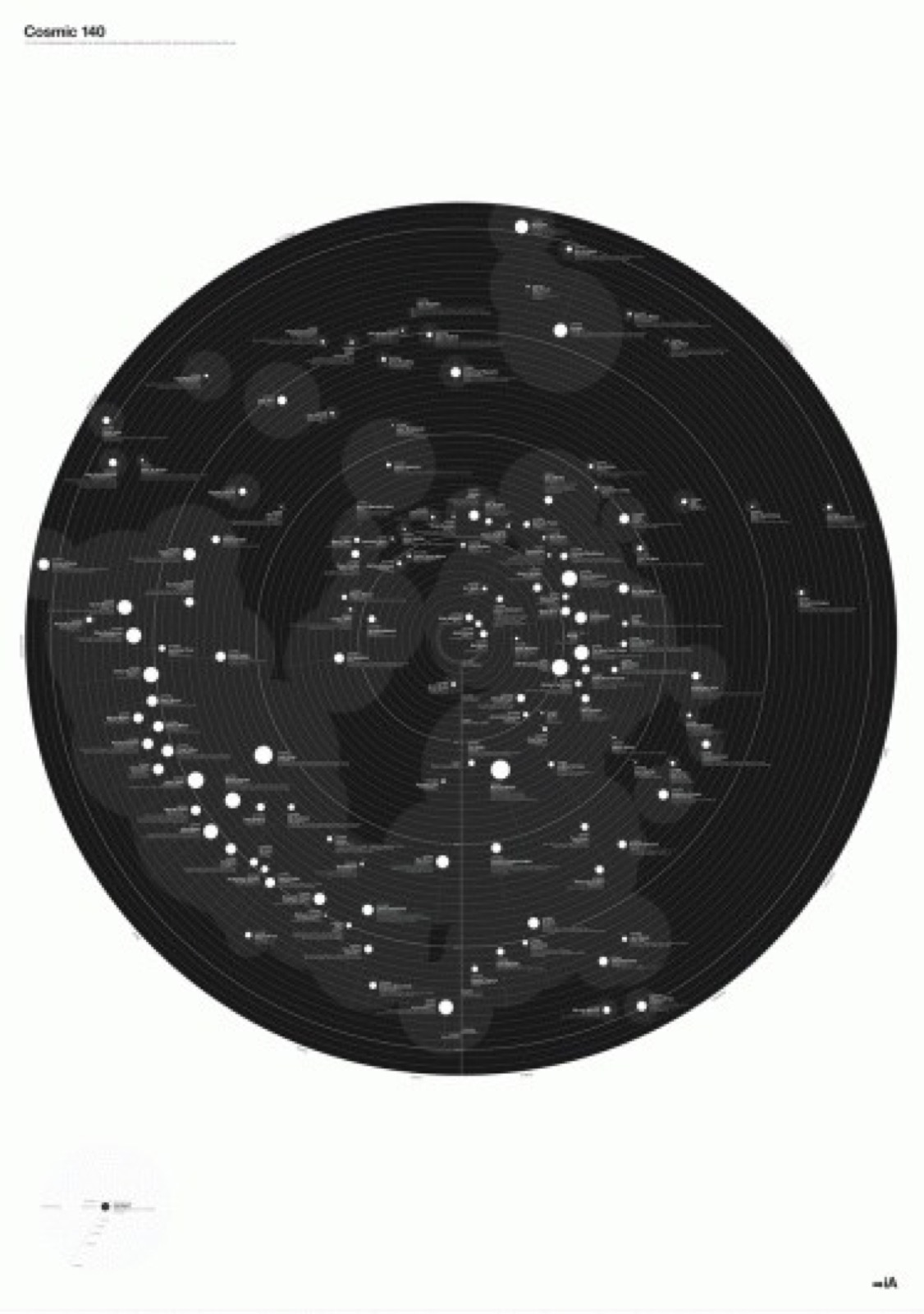
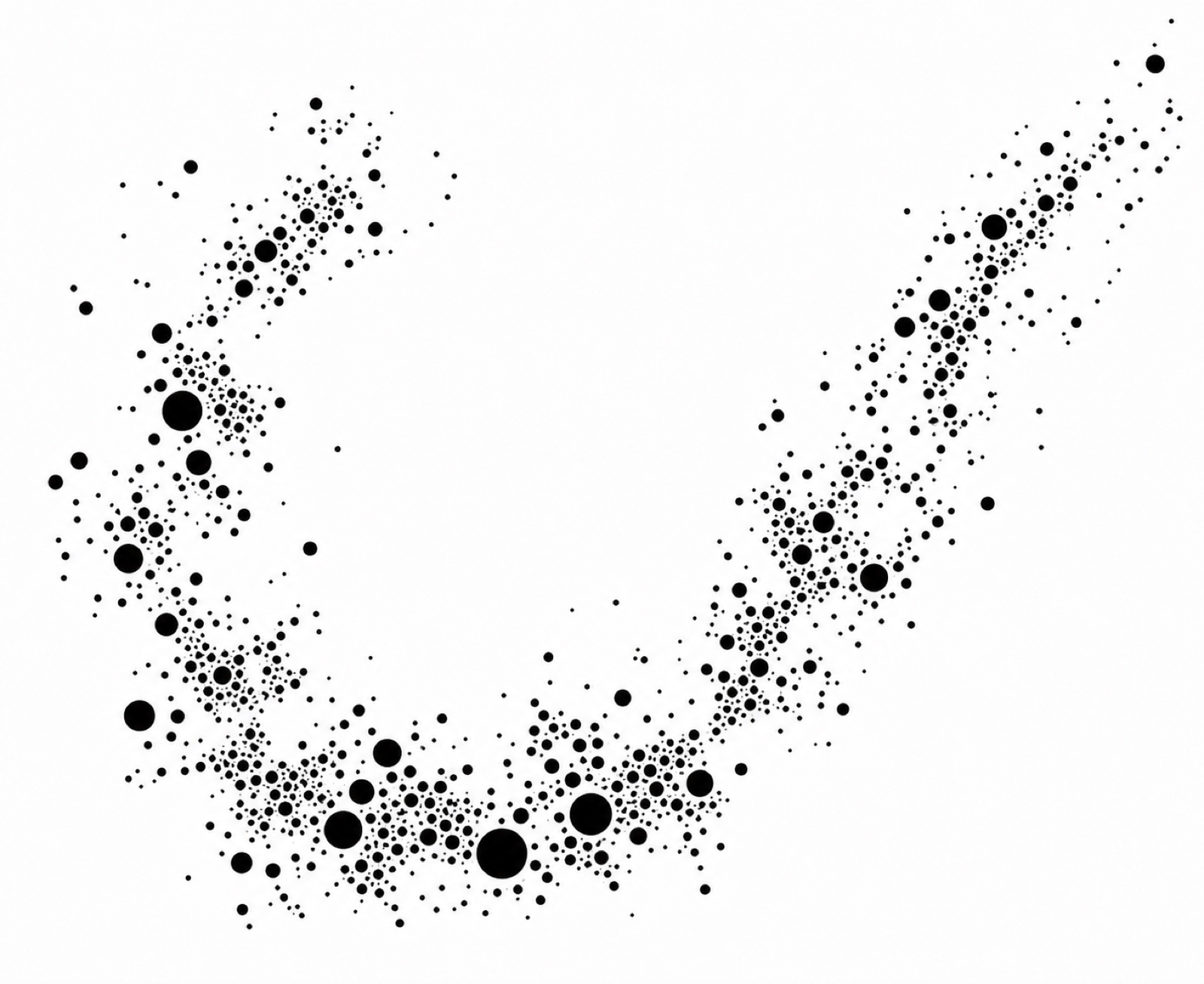
The creative direction is called The Architecture Beneath: precise, confident, deep, engineered, structural. Its theme is data as art. Insurance is a data business, and this brand treats that data the way an engineer treats a cross-section — worth looking at, worth drawing well, never simplified into decoration. The images in this language do not try to be readable first. They try to generate curiosity, and they never lose the relationships inside the data while doing it.
- Data as art. The relationships in the data are never lost, and the representation honors them. Density is not the enemy; condescension is. An elegant rendering of complex data outperforms a simplified chart that respects no one.
- Affected just enough. The discipline is in the restraint — do less, on purpose. Take a strong, simple form and push it exactly one step, to the point where it becomes ownable, and stop. This is how the mark was built, and it is how everything else should be built.
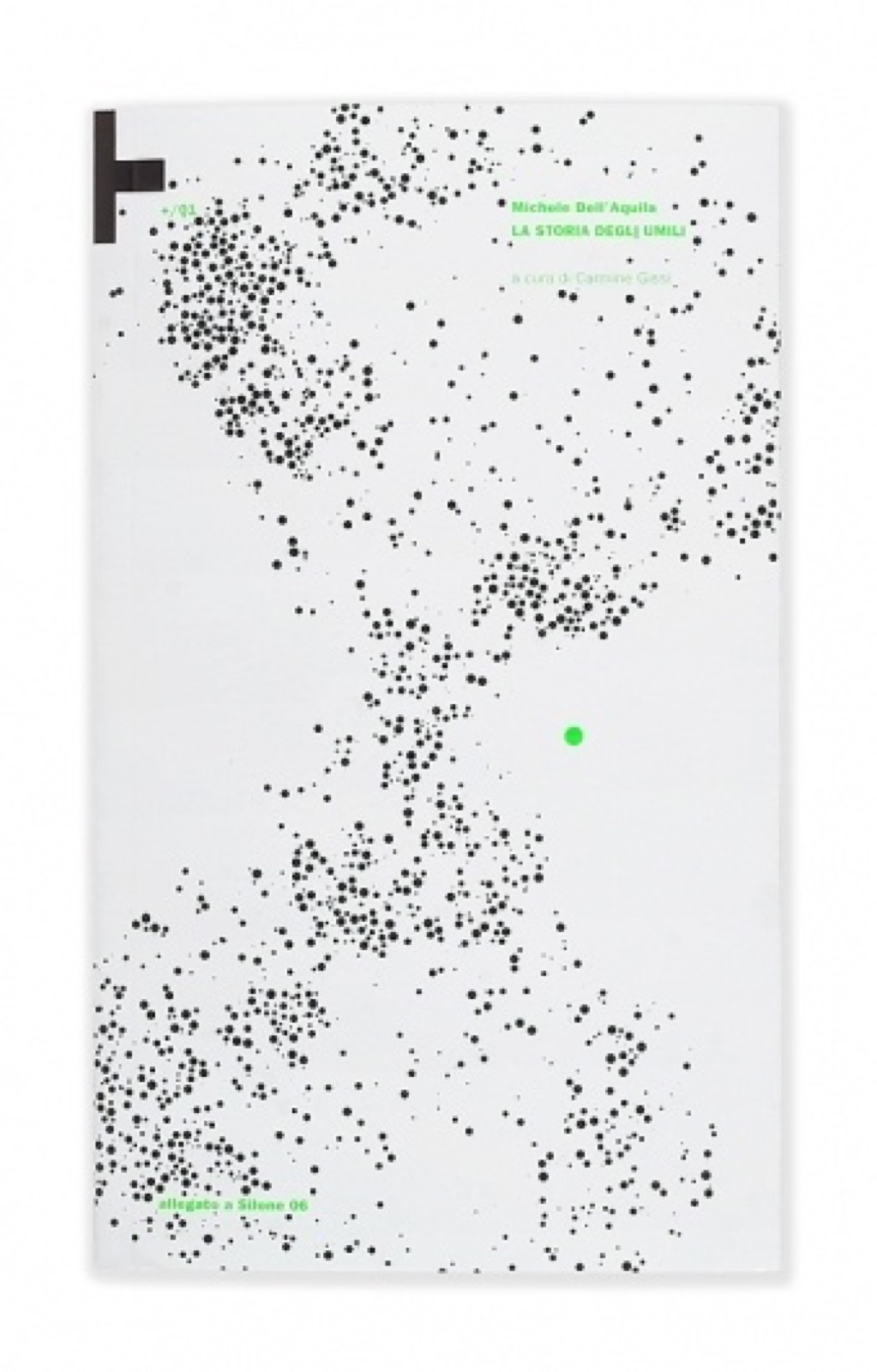
- One punch of color. Black, white, and a single accent. A field of carbon nodes with one amber point tells a story; ten accent colors tell none. When one data point is the story, let one data point be the color.
- Reward the second look. The best marks are geometric at first read, then reveal themselves. Compositions should do the same: what reads as noise resolves into structure — the way actuarial data does when it is rendered honestly.
- Human and data at once. The brand shows people surrounded by the layers of data they carry — a data layer over an iris, orbits around a portrait. Dimensionality without abstraction. What we see as beauty and what data can represent as beauty are the same thing.
- Letters made of our material. The secondary typographic gesture is typography built from data nodes — the same dots that plot the data spell the words. Zoomed in, it is type; zoomed out, the data becomes the subject. No competitor set owns an execution like it.
Photography and texture
Surfaces are dark, structural, and specific: infrastructure detail, engineering cross-sections, precision materials, dark minimal data visualization. Light is directional and earned, never ambient and flattering. When people appear, they appear with their data — layered, dimensional, particular — not as stock talent at desks.
Avoid
- Blue gradients
- Friendly-startup illustration
- Colorful decorative graphics
- Stock office photography

In Use
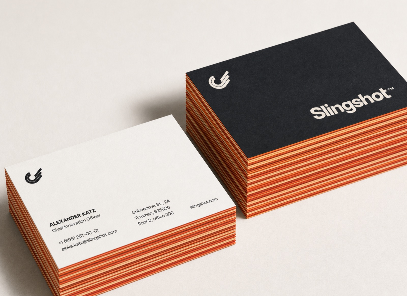
A mark proves itself at application. These executions show the system doing its work across print, apparel, and screen — each one built from the rules in this guide, none of them requiring an exception to look right.
Assets
Every production file, in every configuration this guide defines. Place the files as supplied; nothing here is a template for redrawing. If a context is not covered by these files, the answer is a conversation with the brand team, not a new variant.
Main ID
main-id-positive.pngprimary lockup, Carbon type, full-color mark, for light surfacesFor light grounds↓ PNGmain-id-negative.pngprimary lockup, Warm Stone type, full-color mark, for dark surfacesFor dark grounds↓ PNG
Secondary ID
secondary-id-positive.pnghorizontal lockup, Carbon type, full-color mark, for light surfacesFor light grounds↓ PNGsecondary-id-negative.pnghorizontal lockup, Warm Stone type, full-color mark, for dark surfacesFor dark grounds↓ PNG
Logo mark
logo-mark-positive.pngfull-color mark, for light surfacesFor light grounds↓ PNGlogo-mark-negative.pngfull-color mark, for dark surfacesFor dark grounds↓ PNGlogo-mark-dark.pngsolid Carbon mark, one color, for light surfacesFor light grounds↓ PNGlogo-mark-light.pngsolid Warm Stone mark, one color, for dark surfacesFor dark grounds↓ PNGlogo-mark-knockout.pngkeyline-only mark, light line, for dark and photographic surfacesFor dark grounds↓ PNGlogo-mark-knockout-dark.pngkeyline-only mark, dark line, for light surfacesFor light grounds↓ PNG
One-color lockups
1color-main-id-dark.pngmain ID entirely in Carbon, for light surfacesFor light grounds↓ PNG1color-main-id-light.pngmain ID entirely in Warm Stone, for dark surfacesFor dark grounds↓ PNG1color-secondary-id-dark.pngsecondary ID entirely in Carbon, for light surfacesFor light grounds↓ PNG1color-secondary-id-light.pngsecondary ID entirely in Warm Stone, for dark surfacesFor dark grounds↓ PNG
Master artwork is maintained in the identity production file. PNGs above are supplied at production resolution; request vector exports from the brand team for signage and large-format work.
Master artwork: 100_slingshot-id-production.ai — available on request